Lesson 01 — Use the Elements on Purpose: Line, Shape, Color, Balance, Contrast
Learners meet the five building blocks of visual work — line, shape, color, balance, and contrast — and learn to use them deliberately, not by accident. A worked example builds a "calm" composition and a "storm" composition from the same five elements, then each learner makes one deliberate piece to express a chosen idea or feeling and writes a short artist's statement naming the choice and the reason.
Objectives
Objectives
- D07.S1.06.01 Use the elements and principles of art such as line, shape, color, balance, and contrast deliberately to express an idea or feeling.
Essential question
How do I use line, shape, color, balance, and contrast on purpose to express an idea or feeling?
Key vocabulary
Materials
Standard materials
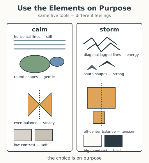
- Elements-and-principles poster · 1 A poster naming the five building blocks — line, shape, color, balance, contrast — each with a simple drawn example, plus the worked example (a 'calm' composition and a 'storm' composition)
- Drawing paper and mark-makers · per learner Paper and anything that marks — pencils, charcoal, crayons, pastels, ink — in at least a light and a dark value
- Artist's-statement slip · 1 per learner A short page with two prompts — "My idea/feeling is ___" and "I chose ___ (element) to ___ (effect), because ___"
Low-tech / no-cost
- Ground, sand, or chalk and a stick Draw the deliberate composition in earth or with chalk on stone; no paper or purchased marks needed
- Voice and body Say the idea aloud and "draw" each element in the air with a finger, explaining the choice; no paper needed
Enriched / lab & device
- A digital drawing tool · 1 per learner A tablet or laptop app with line, shape, fill, and color tools to try the same deliberate choices digitally and compare with the hand-drawn version
- A color wheel or color cards · 1 set Printed cards of hues to support deliberate color choices (warm vs cool, light vs dark) before drawing
Works in different contexts
- large-group Model the calm-versus-storm worked example on a board the whole room can see, then have learners make their own piece in small clusters and share one element-choice each
- multi-age Younger learners choose one element to make a feeling (e.g., "jagged lines feel sharp"); older learners combine two or more elements and explain the interaction in a full sentence
- self-directed A learner reads the worked example, makes a piece expressing one chosen feeling, and completes the artist's-statement slip alone, then checks their own statement against the piece
- level-grouped Learners ready to extend make two versions of the same idea (e.g., "energy" once calm, once bold) and name exactly which element they changed and why
- outdoor-only Gather found lines and shapes from the environment — a straight branch, a jagged stone, a round leaf — and arrange them into a deliberate composition on the ground, then state the feeling it makes
Lesson 1 — Use the Elements on Purpose: Line, Shape, Color, Balance, Contrast
Summary
Learners meet the five building blocks of visual work — line, shape, color, balance, and contrast — and learn to use them deliberately, not by accident. A worked example builds a “calm” composition and a “storm” composition from the same five elements, then each learner makes one deliberate piece to express a chosen idea or feeling and writes a short artist’s statement naming the choice and the reason.
Objectives
- Use the elements and principles of art — line, shape, color, balance, and contrast — deliberately to express an idea or feeling. (D07.S1.06.01)
Connection
Everywhere you look, someone made a choice about lines, shapes, color, balance, and contrast — a food stall’s sign with its big red circle and bold letters, a woven basket with its even bands of light and dark, a game’s start screen with its calm sky and a sudden bright button. The makers didn’t just throw marks at the page; they chose, on purpose, what would make you feel a certain way. Today you become that maker: you pick a feeling, then pick the lines, shapes, colors, balance, and contrast that carry it — the way a storm cloud gathers dark sharp edges while a still pond holds long smooth ones.
Materials
- Elements-and-principles poster
- Drawing paper and mark-makers
- Artist’s-statement slip
Preparation
- Print or draw the elements-and-principles poster, including the worked example (calm vs storm).
- Gather paper and mark-makers with at least a light and a dark value.
- Copy an artist’s-statement slip for each learner.
- Recall Grade 5: learners planned and completed an artwork with a clear idea, choosing materials and techniques to fit the idea.
Facilitator note
This lesson is written to the learner (“you”). The one idea to land is deliberateness:
the elements are not decoration, they are chosen to express an idea or feeling, and a
learner can name the choice and its reason. Model the calm-versus-storm worked example
fully before learners work (explicit instruction for a novice skill — Kirschner, Sweller &
Clark, 2006). Keep “balance” and “contrast” concrete — “balance = is it even or off-center?”
and “contrast = how big is the difference between light and dark (or rough and smooth)?”
There is no wrong feeling to express, and no “better” element; the goal is that the choice
is on purpose and can be said aloud. These same five building blocks appear in art
traditions around the world (see docs/facilitation.md on honoring diverse traditions);
mention that artists everywhere choose from the same small toolkit, which is what makes
their work legible across places and times. See docs/contexts.md on small-group work.
Procedure
- Gather (5 min). Last year you planned an artwork with a clear idea and chose materials to fit it. Today you meet the five building blocks every visual maker uses — line, shape, color, balance, and contrast — and learn to use them on purpose.
- Meet the elements (10 min). Look at the poster. Here is a worked example. To express calm, you might draw long horizontal lines (still, like a sleeping horizon), soft round shapes, an even balance (the same weight on both sides), and low contrast (light and dark close together, nothing shouting). Now flip the same five elements to express storm: diagonal jagged lines (energy, like wind), sharp shapes (strong, pointed), an off-center balance (weighted to one side — tension), and high contrast (very dark against very light — bold). Same five tools, opposite feelings. The difference is deliberate choice.
- Choose your idea (5 min). Pick one idea or feeling to express — calm, storm, celebration, loneliness, energy, pride, worry, home, danger, peace. Say it to a partner in one word.
- Make it deliberately (15 min). Draw your piece. For each element, ask: which line fits my feeling? which shape? which color or value? is my balance even or off-center — and why? how much contrast do I want? Make each choice on purpose.
- Write your artist’s statement (10 min). On your slip, finish two sentences: “My idea/feeling is ___” and “I chose ___ (element) to ___ (effect), because ___.” Show a partner your piece and read your statement; the partner points to where they see the element doing the work.
- Close (5 min). You did what every artist, sign-painter, and map-maker does: you chose, on purpose, how a picture would make someone feel. Keep your piece — this unit you will compare art, compose, perform, and design, all with the same deliberate hand.
Differentiation
- Support: Provide a feeling word and a sentence frame — “I used ___ lines because ___ feels ___” — and limit the task to two elements used deliberately.
- Extension: Make a second version of the same idea (e.g., “energy” once bold, once calm) and write one sentence naming exactly which element you changed and why.
Assessment
- Formative (observation/self): Can the learner name at least one element they chose and connect it, with a reason, to the idea or feeling they meant to express?
- Artifact (portfolio): The deliberate piece and its artist’s statement, kept for the unit portfolio.
- Self-check: The learner asks, “Did I choose each element on purpose, and can I point to where it shows and say why?”
Home connection
Find one designed image in your day — a sign, a wrapper, a poster, a screen — and name one element (line, shape, color, balance, or contrast) the maker chose, and the feeling it gives you.
Resources
- The elements and principles of art (line, shape, color, balance, contrast) are the standard vocabulary of visual-art education worldwide. The Metropolitan Museum of Art’s Heilbrunn Timeline offers classroom-friendly framing of how artists choose these elements across cultures and times: https://www.metmuseum.org/toah/
- Kirschner, Sweller & Clark (2006), “Why Minimal Guidance Does Not Work,” on modeling worked examples before independent practice.