Lesson 02 — Perspective, Framing, Emphasis — and Revising After Feedback
Learners discover that perspective, framing, and emphasis are deliberate choices that shape what a viewer notices and feels — wide makes a subject small, close makes it important, emphasis pulls the eye — and that these choices carry power (and, used carelessly, can manipulate). They apply the ideas to their own Lesson 1 artwork, give and receive specific feedback, and make one revision so their message lands more clearly.
Objectives
Objectives
- D07.S1.07.02 Explain how perspective, framing, or emphasis shapes what a viewer notices and feels about an image.
- D07.S1.07.01 Create an artwork that communicates a personal message and revise it after feedback.
Essential question
How do perspective, framing, and emphasis shape what a viewer notices and feels — and how do I use feedback to make my message land?
Key vocabulary
Materials
Standard materials
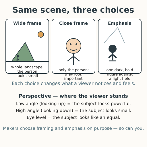
- Framing-and-emphasis poster · 1 The same scene drawn three ways — wide frame, close frame, and emphasis — with labels naming what each makes the viewer notice and feel
- Learner artwork from Lesson 1 · per learner The personal-message artwork each learner began, brought to today's lesson
- Feedback slip · 1 per learner Two prompts — 'What I noticed first was ___' and 'One change that would make your message stronger is ___' — plus a 'what I will change' line
Low-tech / no-cost
- A found frame (hands, twigs, or a cut page) Make a frame with two L-shaped fingers or a torn opening in a page and move it around a scene to change the framing; no poster needed
- Voice and body Describe the three choices aloud — wide, close, emphasized — and act out looking up (low angle) versus looking down (high angle)
Enriched / lab & device
- Camera or phone · 1 per group Take three photos of the same subject — wide, close, and with one emphasized element — to compare how each changes what a viewer notices
- A digital image tool · 1 per learner Crop, zoom, or adjust contrast to try framing and emphasis choices before revising the hand-made artwork
Works in different contexts
- large-group Model the three choices on the poster to the whole room, then run feedback in pairs with a shared sentence frame so every learner both gives and receives one specific note
- multi-age Younger learners name one framing change; older learners also name the *feeling* each change produces and explain why
- self-directed A learner studies the poster, makes one framing or emphasis change to their artwork, and writes a self-feedback note naming what changed and why
- level-grouped Learners ready to extend make two versions of their message (e.g., wide and close) and write which better carries the message and why
- outdoor-only Use a real scene — a tree, a doorway, a classmate — and move nearer and farther, and crouch low versus stand on a step, naming how the subject's size and power seem to change; no paper needed
Lesson 2 — Perspective, Framing, Emphasis — and Revising After Feedback
Summary
Learners discover that perspective, framing, and emphasis are deliberate choices that shape what a viewer notices and feels — a wide frame makes a subject small, a close frame makes it important, and emphasis pulls the eye to one thing. They notice that these choices carry power, and that the same tool can be used honestly or to manipulate. Then they apply the ideas to their own Lesson 1 artwork, give and receive specific feedback, and make one revision so their message lands more clearly.
Objectives
- Explain how perspective, framing, or emphasis shapes what a viewer notices and feels about an image. (D07.S1.07.02)
- Create an artwork that communicates a personal message and revise it after feedback. (D07.S1.07.01 — the “revise after feedback” half)
Connection
Think of two photos of the same leader: one shot from below, so the person towers over you like a mountain; one shot at eye level, so they look like a neighbor you could talk to. Neither photo lied — both are the same real person — but each chose where to stand and what to leave in the frame, and that choice changed how you felt. Posters, ads, news photos, and game menus all do this on purpose. Today you learn to read that choice in others’ images — and to make it, deliberately, in your own, so your message is the one you actually mean.
Materials
- Framing-and-emphasis poster (wide / close / emphasis)
- Your artwork from Lesson 1
- Feedback slip
Preparation
- Print or draw the framing-and-emphasis poster, including the perspective notes (low angle, high angle, eye level).
- Have learners bring the artwork they began in Lesson 1.
- Copy a feedback slip for each learner.
Facilitator note
This lesson is written to the learner (“you”). Two ideas land together: (1) perspective,
framing, and emphasis are choices with effects, and (2) feedback is information that
sharpens the work, not a verdict on the person (see docs/assessment.md on mastery and
feedback). Model the three choices on the poster, then model giving one specific, kind
feedback note before learners give each other any. Keep the ethics lens visible: the same
framing tools that make a hero look heroic can make a stranger look dangerous — ask learners
to notice who benefits from an image’s choices (egalitarianism), and hold that the tool
itself is neutral while its use has consequences. Feedback stays about the artwork, never
the learner, and a learner may always choose which feedback to act on.
Procedure
- Gather and recall (5 min). Last lesson you chose a message and planned how to carry it. Today you learn three levers that change how a viewer notices and feels — and you use them to make your message land.
- Meet the three levers (15 min). Look at the poster. Here is the same simple scene — a person walking toward a mountain — drawn three ways. A wide frame shows the whole landscape, so the person looks small (part of something big). A close frame shows only the person, so they look important. Emphasis draws the eye to one thing — one dark, bold figure against a light field. Now add perspective — where the viewer stands. A low angle (looking up) makes a subject look powerful; a high angle (looking down) makes it look small; eye level makes it look like an equal. Every poster, photo, and game menu you have ever seen used these levers. Ask yourself, always: who chose this frame, and what did they want me to feel?
- Apply it to your artwork (10 min). Look at your own piece. Which lever could make your message stronger — a closer frame on your symbol? more emphasis on the main thing? a lower angle so the subject feels strong, or eye level so it feels like a friend? Choose one change.
- Feedback pairs (10 min). Swap artworks with a partner. On your slip, write two specific things: “What I noticed first was ___” and “One change that would make your message stronger is ___.” Be kind and specific — not “it’s bad,” but “the hands are small, and your message is about caring, so making the hands bigger could help.” Then switch roles.
- Revise (10 min). Read your partner’s note. Choose what to act on — you are the author; feedback is information, not an order. Make one revision to your artwork.
- Close (5 min). You read images and you sharpened your own. Remember: the same tools can honor or mislead, so ask who benefits from a frame. Keep your revised artwork — it is your portfolio’s first finished piece.
Differentiation
- Support: Limit the task to one lever — choose framing (wider or closer) or emphasis (darken the main thing) — with a sentence frame: “I made ___ bigger/darker/closer because my message is ___.”
- Extension: Make a second version of the same artwork with the opposite framing choice and write one sentence comparing what each makes a viewer feel.
Assessment
- Formative (observation/peer): Can the learner name which lever (perspective, framing, or emphasis) they changed, and connect it — with a reason — to their message or to what a viewer notices and feels?
- Artifact (portfolio): The revised artwork plus the feedback slip, showing the note received and the revision made.
- Self-check: The learner asks, “Can I point to one thing I changed after feedback and say why it makes my message clearer?”
Home connection
Look at one photo, poster, or screen at home. Name the frame (wide or close), the angle (low, high, or eye level), and one thing emphasized — then say what the maker probably wanted you to feel.
Resources
- The Metropolitan Museum of Art’s Heilbrunn Timeline, for how artists across cultures and eras use composition to guide the viewer: https://www.metmuseum.org/toah/
- The idea that framing and emphasis are persuasion tools appears in media-literacy frameworks; NAMLE’s “Key Questions” ask who made this and why: https://namle.org/resources/key-questions/
- Kirschner, Sweller & Clark (2006), “Why Minimal Guidance Does Not Work,” on modeling worked examples before independent practice.