Lesson 14 — Detecting Misleading Statistics and Defending with Honest Data
Learners detect and critique misleading statistics and data visualizations — truncated axes, cherry-picking, spurious correlation, p-hacking — and algorithmic bias in what they see, then redraw a chart honestly and defend a conclusion with data. They meet Du Bois's and Nightingale's honest data visualization as a tradition of using numbers to argue for justice, and close the unit's capstone question: who benefits when a number misleads?
Objectives
Objectives
- D05.S4.12.02 Detect and critique misleading statistics, data visualizations, and algorithmic bias in media and public life, and defend a conclusion with honest data.
Essential question
How do I detect misleading statistics, visualizations, and algorithmic bias, and defend a conclusion with honest data?
Key vocabulary
Materials
Standard materials
- Misleading-vs-honest chart sheet · 1 per learner Two versions of the same data — one truncated and one full-axis — plus a spurious pair to debunk
- Math journal · 1 per learner
Low-tech / no-cost
- Graph paper and a ruler Redraw a truncated chart with a full axis and watch the story change
- Two numbers that happen to move together Any coincidental pair to test for spurious correlation
Enriched / lab & device
- A chart-making tool and a live data source · 1 per pair Redraw a real chart honestly, and check a suspicious claim against an authoritative dataset
Works in different contexts
- large-group Debunk one misleading chart whole-class, then pairs redraw a second and present the honest version
- multi-age Younger learners spot which chart "looks scarier"; older learners name the trick (truncated axis) and redraw honestly
- self-directed A learner audits a chart for tricks, redraws it honestly, and writes a one-paragraph defense
- level-grouped A ready group also distinguishes correlation from causation on a spurious pair and explains p-hacking
- outdoor-only Sketch the same data on two chalk axes — one truncated, one full — and compare what each seems to say
Lesson 14 — Detecting Misleading Statistics and Defending with Honest Data
Summary
Learners detect and critique misleading statistics and data visualizations — truncated axes, cherry-picking, spurious correlation, p-hacking — and algorithmic bias in what they see, then redraw a chart honestly and defend a conclusion with data. They meet Du Bois’s and Nightingale’s honest data visualization as a tradition of using numbers to argue for justice, and close the unit’s capstone question: who benefits when a number misleads?
Objectives
- Detect and critique misleading statistics, data visualizations, and algorithmic bias, and defend a conclusion with honest data. (D05.S4.12.02)
Connection
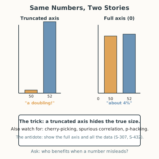
Two charts can show the same numbers and tell opposite stories — one starts its axis at zero, the other crops it to make a 2% change look like a doubling. A headline can pick the one year that flatters its point, or pair two things that rise together by pure coincidence (ice-cream sales and drownings both rise in summer). And a recommendation system can quietly bias what you even see. Learning the tricks — and how to redraw honestly — turns you from a target of misleading numbers into someone who can set the record straight.
Materials
- Misleading-vs-honest chart sheet
- Math journal
- Low-tech: graph paper and ruler
Preparation
- Prepare two versions of one dataset (truncated vs full axis) and a spurious pair.
- Retrieval: from Lesson 13, margin of error and significance; from Lessons 4 and 8, critiquing claims and algorithmic bias. Today we audit visuals and defend with data.
- Prepare the truncated-axis worked example to model first (S-011).
Facilitator note
This lesson is written to the learner (“you”). The idea to land: misleading statistics work through concrete tricks — a truncated axis, cherry-picked years, a spurious correlation (correlation ≠ causation), p-hacking, and algorithmic bias — and each has an honest counterpart: show the full axis, show all the data, state the third variable, and defend a conclusion with the whole dataset. Teach the truncated-axis example explicitly (S-011), then let learners redraw and argue — the defense is the learning. Keep evidence and value distinct: the same honest chart can support different value judgments; honesty is about the data, not about winning the argument.
The ethics lens: a chart that exaggerates a small effect is a lie of presentation — honesty is a choice made axis by axis. The egalitarianism lens: ask who benefits when a number misleads — misleading statistics are often aimed at the people with the least power to check them. The global lens: honest data visualization has a proud, worldwide lineage — W. E. B. Du Bois and his collaborators hand-drew charts for the 1900 Paris Exposition to show the real condition of Black Americans against racist claims (S-432), and Florence Nightingale used her “coxcomb” charts to argue for hospital reform (S-433). The technology lens: algorithmic ranking can bias what we see before any chart is drawn, so critique must start upstream of the pixels (S-481). The environment lens: climate and energy arguments are exactly where truncated axes and cherry-picked years are used to delay or deny — honest axes matter for the living Earth (S-005). The critical-thinking lens: correlation is not causation, and a spurious pair must be named, not believed (S-307). Preview: this closes the unit; gather the portfolio artifacts into a capstone.
Procedure
- Recall (5 min). From Lesson 13, what a margin of error is. From Lesson 4, the four-step claim check. Today we audit pictures.
- The truncated axis (10 min). Look at two bar charts of the same data: one starts its vertical axis at 0; the other starts at 50, so a change from 50 to 52 looks like a doubling. Name the trick: a truncated axis hides the true size of the difference.
- Worked example — redraw honestly (12 min). Given the truncated chart, redraw it with the axis starting at 0. Now the “huge” jump is visibly 2 out of 52 — about 4%. Write one sentence on what each version makes you feel and which tells the truth.
- Three more tricks (10 min). Cherry-picking shows only the favorable year; spurious correlation pairs two things that rise together by chance (ice-cream sales and drownings both rise in summer — the third variable is heat) (S-307); p-hacking tries many tests and reports only the one that “passes.” Name each and give its honest antidote.
- Algorithmic bias in the feed (5 min). Before you see a chart, a ranking algorithm may have already chosen which charts you see (S-481). Critique starts before the picture: what is not shown?
- Defend with honest data (10 min). With a partner, choose a claim you care about (from the unit or your life). Redraw its chart honestly — full axis, all the data — and write a two-sentence defense: what the data actually shows, and what it does not show. Swap and challenge each other’s chart for hidden tricks.
- Close and gather (3 min). Say — or write, sign, gesture, or use AAC to express — who benefits when a number misleads, and add today’s honest chart to your unit portfolio.
Differentiation
- Support: Redraw the truncated chart with a full axis and state the difference as a percentage before tackling the other tricks.
- Extension: Find a real misleading chart in current media, name every trick it uses, and publish an honest redraw with a written defense citing the data source.
- Number access (dyscalculia): Provide the step-3 chart grid pre-printed with a full axis from 0, so redrawing the bar honestly is a matter of transferring heights rather than computing; offload the percentage check (2 out of 52 ≈ 4%) to a partner or calculator; and take the verbal route — set the two charts side by side and say which “looks scarier” and why (the axis is chopped), naming each trick in words without any division.
- Communication access: Every spoken step — saying, naming, reading aloud, discussing, or closing — can be done in writing, sign, gesture, or AAC instead. Learners who are non-speaking, d/Deaf, hard-of-hearing, or who use AAC complete every task in their preferred mode; no step requires producing or hearing sound.
Assessment
- Formative (peer + self): Can the learner name the tricks (truncated axis, cherry-picking, spurious correlation, p-hacking, algorithmic bias), redraw a chart honestly, and defend a conclusion with data (in speech, writing, sign, or AAC)?
- Portfolio artifact (unit capstone): The honest redraw with a written defense, added to the unit portfolio.
Home connection
Find one chart or “study shows” claim at home or on a screen, name one trick it might be using, and write one sentence on how you would check or redraw it honestly.
Resources
- On worked examples and guided practice: Kirschner, Sweller & Clark (2006) (S-011).
- On correlation ≠ causation and spurious pairs: Tyler Vigen — Spurious Correlations (S-307). On honest data visualization for justice: Du Bois’s Data Portraits (S-432); Florence Nightingale’s statistical work (S-433). On algorithmic bias and feeds: Britannica — Social media (S-481). On climate data arguments: IPCC (S-005).