Lesson 02 — Graphs Support or Revise a Claim
Learners turn yesterday's absorbency table into a bar graph and use it to decide whether their claim is supported or must be revised. They learn the parts of a bar graph, the habit of letting the data answer rather than making the data say what they hoped, and that revising a claim is a normal, honest part of science.
Objectives
Objectives
- D06.S1.06.01 Collect and organize data in tables and graphs, and use them to support or revise a claim.
Essential question
How does a graph help us decide whether to keep or revise a claim?
Key vocabulary
Materials
Standard materials
- Graph paper (or a printed bar-graph frame) · 1 per learner Axes already drawn with a scale, ready to fill with bars
- Yesterday's absorbency table · 1 per learner The data collected in Lesson 1, to graph
- Claim-check page · 1 per learner A page with "my claim," "the graph shows," and "support or revise" boxes
Low-tech / no-cost
- Chalk, dirt, or string on the ground Draw a bar graph on the ground with lines of stones or beans for the bars
- Voice and body Learners stand in rows as living bars, one row per cloth, taller rows for more drops
Enriched / lab & device
- A device with a spreadsheet or graphing app · 1 per group Enter the table and generate a bar graph; compare the app's graph to the hand-drawn one
- A second small data set (e.g., bird counts at two times of day) · 1 per group To practice graphing a fresh set and making a new claim
Works in different contexts
- large-group Build one large bar graph on the board together; the group decides what each bar's height means before drawing
- multi-age Younger learners count and stack objects to make the bars; older learners choose the scale and explain why bars need equal spacing and a labeled axis
- self-directed A learner graphs their own Lesson 1 data, writes the claim, and decides support vs. revise with a one-sentence reason
- level-grouped Learners ready to extend plot a second data set and compare two graphs to one claim
- outdoor-only Make a ground graph with sticks for axes and stones for bars; a taller bar is more stones, read left to right
Lesson 2 — Graphs Support or Revise a Claim
Summary
Learners graph the data they collected yesterday and use the picture to decide whether their claim is supported or must be revised. They learn the parts of a bar graph — axes, scale, and bars — and, more importantly, the honest habit at the heart of science: let the data answer the question, even when the answer is not what you hoped.
Objectives
- Organize data in a graph and use it to support or revise a claim. (D06.S1.06.01)
Connection
A picture of numbers can show in one glance what a long list hides. A farmer deciding which seed to plant, a shopkeeper seeing which goods sell, a weather office tracking rainfall over a year — they all read graphs. A graph does not prove you right; it shows you what the numbers actually say. Sometimes they back you up, and sometimes they gently correct you. Both results are useful. Today you learn to read that picture honestly.
Materials
- Graph paper or a printed bar-graph frame
- Yesterday’s absorbency table
- Claim-check page
Preparation
- Print a bar-graph frame with labeled axes and a scale for each learner.
- Have yesterday’s tables ready for the recall and graphing.
- Recall Lesson 1: the claim each learner wrote (“the thickest cloth absorbs the most”).
Facilitator note
Written to the learner (“you”). Two moves to land: (1) the parts of a bar graph
(labeled axes, an even scale, equal-width bars) and (2) the habit of support or
revise — the data answers the question, not the other way around. This is the
unit’s ethics anchor: we teach learners to let the data answer, not to bend data to
a hoped-for answer. Model the worked example: read the tallest bar, say aloud what it
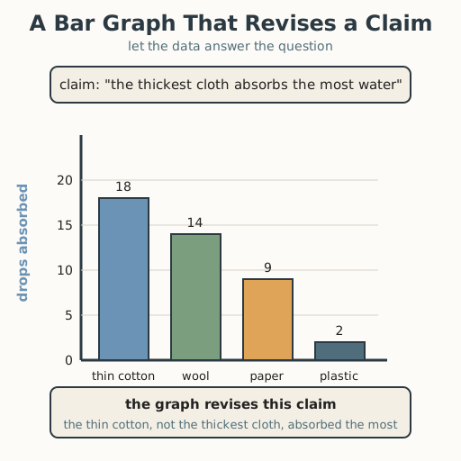
means, then check the claim against it. The graph in the asset deliberately revises
the claim (thin cotton beats the thick cloth), because that is the more honest — and
more common — outcome, and it normalizes revision rather than treating a “wrong”
claim as failure. Distinguish evidence (“the cotton bar is tallest”) from a value
(“revision is good, not shameful”). See
docs/facilitation.md.
Procedure
- Gather and recall (5 min). What did your table show yesterday? What claim did you write? Today you will check that claim with a graph.
- Meet the bar graph (10 min). A bar graph has two axes: the horizontal one lists what you tested (cloth type), the vertical one has a scale (0 to 20 drops). Each bar stands for one cloth, and its height shows the number. Look at the worked example: the tallest bar is thin cotton. Say aloud what that bar means.
- Graph your data (15 min). Using yesterday’s table, draw one bar for each cloth. Keep bars the same width and leave an even gap between them. Label both axes and give the graph a title.
- Check the claim (10 min). Read your graph. Does it support your claim, or does it revise it? On your claim-check page write “my claim,” then “the graph shows,” then circle support or revise — and finish the sentence “I had to revise because…” if the graph disagrees. Remember: revising a claim is a win, not a loss; it means you learned what the data actually says.
- Close (5 min). A graph turns a table into a picture, and the picture answers the question — sometimes by saying “yes,” sometimes by saying “not quite; look again.” Both answers are real evidence.
Differentiation
- Support: Provide pre-scaled bars to color in, and a two-box sheet (supported | revised) with a word bank for the reason.
- Extension: Graph a second data set (bird counts at two times of day) and write a fresh claim; compare how the two graphs make two different claims visible.
Assessment
- Formative (observation): Does the learner draw equal-width bars on a labeled scale, and state whether the graph supports or revises the claim with a reason?
- Self-check: The learner asks, “Did I let the data answer, or did I try to make the data say what I wanted?”
Home connection
Ask a question you can count at home (“which fruit do we eat most this week?”), make a quick bar graph with paper, and tell someone whether it supported or surprised what you expected.
Resources
- Khan Academy, “Creating bar graphs” — axes, scale, and equal bars: https://www.khanacademy.org/math/cc-sixth-grade-math/cc-6th-data-statistics/cc-6-shape-of-data/v/creating-bar-charts-1
- BBC Bitesize (KS3), “Graphs and charts” — choosing and reading a bar graph: https://www.bbc.co.uk/bitesize/topics/zsg6m39/articles/zhmbvwx