Lesson 10 — Scatter Plots and Association
Learners **construct and interpret scatter plots** for two related variables and **describe patterns of association** — positive, negative, or none. They plot paired data, read the direction and rough strength of the association, and notice outliers and clusters.
Objectives
Objectives
- D05.S4.08.01 Construct and interpret scatter plots for two related variables and describe patterns of association.
Essential question
How do I construct and interpret a scatter plot, and describe the association between two variables?
Key vocabulary
Materials
Standard materials
- Scatter-plot grid sheet · 1 per learner A grid with two labeled axes for plotting paired data points
- Data card sets · 1 set per pair Cards of paired real data (height and shoe size; study time and score; temperature and layers of clothing) to plot and describe
Low-tech / no-cost
- Voice and a shared board Plot points together from data read aloud; no cards needed
- Found objects Measure two things about real objects (length and width of leaves, or height and arm-span of learners) and plot them
Enriched / lab & device
- A spreadsheet or graphing tool · 1 per group To enter two columns and generate a scatter plot, where devices allow
- A scatter-plot gallery · 1 per group Real scatter plots from news and science to read and describe the association in each
Works in different contexts
- large-group Build one scatter plot together on the board, then have pairs plot their own data and describe the association
- multi-age Younger learners plot the points; older learners describe the direction and strength of the association and spot outliers
- self-directed A learner plots a data set alone, describes the association (positive, negative, or none), and checks against the worked example
- level-grouped Learners ready to extend identify clusters and outliers and say which points most influence the picture
- outdoor-only Measure two real quantities outdoors (leaf length and width, or shadow length and time of day), plot them, and describe the association
Lesson 10 — Scatter Plots and Association
Summary
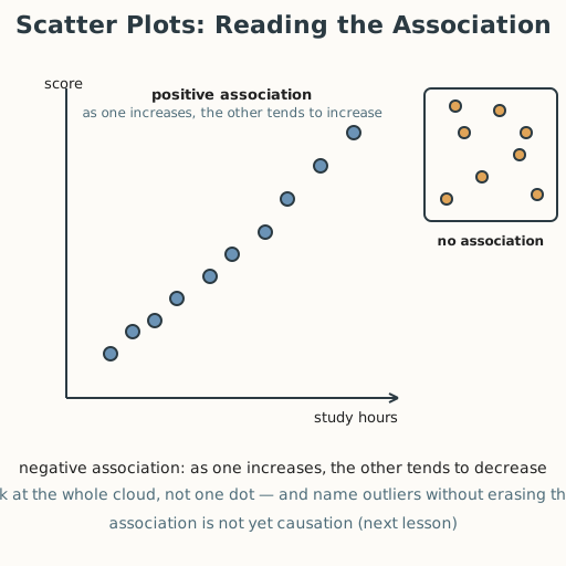
Learners construct and interpret scatter plots for two related variables and describe patterns of association. They plot paired data, read whether the association is positive (both rise), negative (one rises as the other falls), or none, and notice outliers and clusters.
Objectives
- Construct and interpret scatter plots for two related variables, and describe patterns of association. (D05.S4.08.01)
Connection
Taller people tend to have longer feet; more study hours tend to go with higher scores; on a hot day, a cold drink sells faster. None of these is a perfect rule — each person differs — but plotted together, the points lean one way. A scatter plot is how you see that lean: put two measurements on two axes, plot each person or thing as one dot, and the pattern of the dots tells you how the two quantities move together.
Materials
- Scatter-plot grid sheet
- Data card sets
Preparation
- Copy the scatter-plot grid sheet and data card sets.
- Have worked examples ready: study hours (x) vs. test score (y) rising left to right → positive association; temperature (x) vs. layers of clothing (y) falling → negative association; and a set with no clear pattern → no association.
- Recall from Grade 7: summarizing data with center and spread (D05.S4.06.01); random sampling (D05.S4.07.01).
Facilitator note
This lesson is written to the learner (“you”). The ideas to land: (1) a scatter plot places each item as a point with two coordinates — one for each variable; (2) the association describes how the two variables tend to move together: positive (both rise), negative (one rises as the other falls), or none; (3) outliers and clusters are features to name, not mistakes to erase. Because reading a scatter plot is a foundational skill, use explicit instruction, worked examples, and guided practice before independent work (Kirschner, Sweller & Clark, 2006). Watch for the slips of describing association from a single point (look at the whole cloud) and of calling any visible pattern “cause” (hold that for Lesson 11 — association is not yet causation). The egalitarian lens: every dot is a person or thing, and the plot never ranks people — it describes a relationship, with care for the outliers the trend leaves out (philosophy §4). The global lens: reading data in two variables is how public-health workers, farmers, and researchers everywhere see real patterns, using data gathered fairly (S-006). The critical-thinking lens: the whole cloud, not one dot, is the evidence.
Procedure
- Gather (5 min). You can find distances and move shapes. Today you see how two measurements move together.
- Meet the scatter plot (10 min). A scatter plot places each item as a dot with two coordinates — one per variable. The pattern of the whole cloud is the association.
- Worked example — positive (10 min). Plot study hours (x) against test score (y). The points rise from lower-left to upper-right: a positive association — as one increases, the other tends to increase.
- Worked example — negative and none (10 min). Plot temperature (x) against layers of clothing (y): points fall to the right — a negative association. Plot shoe size against favorite number: points scatter with no pattern — no association.
- Plot your own (10 min). With a partner, plot a data card set, then describe the association (positive, negative, or none) and point out any outliers or clusters. Check with another pair.
- Close (5 min). Share one plot and what it shows. Remember: the whole cloud, not one dot, tells the story — and “association” is not yet “cause.”
Differentiation
- Support: Provide pre-plotted axes and a small data set; describe the points aloud for learners with low vision; use “up together,” “one up one down,” or “no pattern” before the formal words.
- Accessibility: Plot points on a tactile grid (raised dots, a pegboard, or stones on a ground grid) and describe the cloud aloud for learners who are blind or have low vision; for learners with dyscalculia, use a small pre-made data set and offload coordinate arithmetic to a partner.
- Extension: Identify clusters and outliers, and explain which points most influence the overall picture and why a single outlier should not be erased.
Assessment
- Formative (observation/performance): Can the learner construct a scatter plot from paired data and describe the association (positive, negative, or none), naming outliers or clusters?
- Self-check: The learner asks, “Did I plot each item with its two correct coordinates? Did I look at the whole cloud? Is my association label right, and did I name any outliers without erasing them?”
Home connection
At home, measure two things that might go together (a person’s height and arm-span, a plant’s height and days of water, a drink’s temperature and how fast it disappears), plot a few points, and describe the association.
Resources
- Scatter plots and association are standard in middle-grades data; see John A. Van de Walle,
Elementary and Middle School Mathematics (10th ed., 2019) (S-026). On gathering and reading data
honestly and globally: Our World in Data (S-006). The claim that association must be read from the
whole cloud, not one point, is a statistical principle (
docs/philosophy.md§7).