Lesson 11 — Comparing Distributions
Learners **summarize and compare distributions** of a single variable using plots and summary statistics: they compute center (mean, median), spread (range, interquartile range), and shape (symmetric or skewed), draw box plots, and compare two distributions in words — connecting "average" to questions of who is left out of the average.
Objectives
Objectives
- D05.S4.09.01 Summarize and compare distributions of a single variable using plots and summary statistics.
Essential question
How do I summarize and compare two distributions of a single variable using plots and summary statistics?
Key vocabulary
Materials
Standard materials
- Comparison sheet · 1 per learner Two small data sets (e.g., two neighborhoods' commute times) to summarize with center, spread, and shape, and to compare in words
- Worked-example card · 1 per learner Two distributions summarized with mean/median, range/IQR, and shape (symmetric or skewed), with a one-sentence comparison
Low-tech / no-cost
- A shared board or large paper Draw the two histograms or box plots; learners copy and annotate by hand
- Found data (two groups of stones, leaves, or sticks) Sort two real piles by length and compare their center and spread with no printed data
Enriched / lab & device
- A spreadsheet or statistics tool · 1 per learner Enter the data and generate histograms and box plots, then read off center and spread
- A real data set from Our World in Data · 1 Two countries' or regions' values on one variable, to compare with real numbers
Works in different contexts
- large-group Summarize one data set together, then pairs summarize the second and compare the two aloud
- multi-age Younger learners find the median and range; older learners add the IQR and describe shape
- self-directed A learner computes center and spread for both sets, draws both box plots, and writes a one-sentence comparison
- level-grouped Learners ready to extend explain how an outlier pulls the mean but not the median, with an example
- outdoor-only Measure a real variable in two places (leaf lengths in sun vs. shade) and compare center, spread, and shape
Lesson 11 — Comparing Distributions
Summary
Learners summarize and compare distributions of a single variable using plots and summary statistics: they compute center (mean, median), spread (range, interquartile range), and shape (symmetric or skewed), draw box plots, and compare two distributions in words — connecting “average” to questions of who is left out of the average.
Objectives
- Summarize and compare distributions of a single variable using plots and summary statistics. (D05.S4.09.01)
Connection
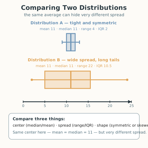
“Average” hides almost everything. Two neighborhoods can have the same average commute time while one is a tight cluster of ten-minute trips and the other is a wild spread from five minutes to two hours. A single number cannot show that difference — you need center (where the middle is), spread (how far the data reaches), and shape (whether it leans). Today you learn to describe and compare a whole distribution, so “average” stops hiding the people at the edges.
Materials
- Comparison sheet
- Worked-example card
Preparation
- Copy the comparison sheet and worked-example card.
- Retrieval: from Grades 6–8, recall mean, median, range, and reading a box plot.
Facilitator note
This lesson is written to the learner (“you”). The skill to land: summarize a distribution with center (mean, median), spread (range, interquartile range), and shape (symmetric or skewed), and compare two distributions using all three. Use a worked example first (S-011): two small data sets with the same mean but very different spreads and shapes, summarized side by side. The critical-thinking lens: one summary number (the mean) is not “the answer” — a distribution is the whole picture, and you must say which measure of center fits a skewed shape (median, not mean). The egalitarian lens: the mean hides the people at the edges; describing spread and shape is how data tells you who is left out — the same idea behind honest reporting on income, health, and access (S-006). The global lens: comparing distributions is the same act everywhere — two seasons of rainfall, two regions’ harvests, two groups’ test scores — and it is the first step from “numbers” to “questions.” The ethics lens: reporting only the “average” when the spread tells a different story is a form of dishonesty — honest data work means showing center, spread, and shape, not picking the number that flatters (philosophy §5). The technology & environment lens: software draws a box plot in a moment, but the human must choose which measure of center is honest for a skewed shape; and distributions of rainfall, temperature, and harvest describe the environment we depend on. Keep it grounded in real, small data the learner can sort by hand.
Procedure
- Recall (5 min). From Grades 6–8: what is the median? The range? What does a box plot show?
- Meet the three descriptors (8 min). Center = where the middle is (mean, median). Spread = how far the data reaches (range, interquartile range). Shape = whether it is symmetric or skewed (leans left or right).
- Study the worked example (12 min). Data set A: 9, 10, 10, 11, 11, 11, 12, 12, 13. Data set B: 2, 4, 6, 10, 11, 11, 12, 19, 24. Both have mean 11 — but A is tightly clustered (range 4) and symmetric, while B is spread wide (range 22) with long tails. Write the comparison: “Same center, very different spread.”
- Compute and draw (15 min). On the comparison sheet, for two new data sets (two neighborhoods’ commute times in minutes), compute the median, mean, range, and IQR, and draw a box plot for each.
- Compare in words (10 min). Write a two-sentence comparison naming center, spread, and shape. Which neighborhood’s “average” hides more variety? Whose experience does the mean not represent?
- Close (5 min). Center, spread, shape — three words that keep “average” honest.
Differentiation
- Support: Provide the five-number summary pre-computed and ask learners to draw the box plots and write the comparison.
- Extension: Add one extreme outlier to a data set and explain, with numbers, why the mean moves but the median barely does.
Assessment
- Formative (observation): Can the learner compute center and spread and write a comparison that names center, spread, and shape?
- Portfolio artifact: The completed comparison sheet with two box plots, kept in the portfolio.
Home connection
Collect one small set of real numbers at home (ages of people you know, prices at a market, times of a repeated trip). Compute the median and range and describe the shape in one sentence.
Resources
- On real distributions and the limits of “average”: Our World in Data, https://ourworldindata.org/ (S-006).
- On explicit instruction and worked examples: Kirschner, Sweller & Clark (2006), https://doi.org/10.1207/s15326985ep4102_1 (S-011).