Lesson 02 — Trend: How Well Does the Data Support the Conclusion?
Learners read a trend in a scatter plot, distinguish correlation from causation, and practice judging how well data support a conclusion by weighing sample size, variability, and the direction of the relationship. This completes the unit's statistics objective.
Objectives
Objectives
- D06.S1.10.01 Analyze data using basic statistics (mean, range, and trend) and assess how well the data support a conclusion.
Essential question
How do I read a trend in data, and how do I judge whether the data really support the conclusion someone draws from them?
Key vocabulary
Materials
Standard materials
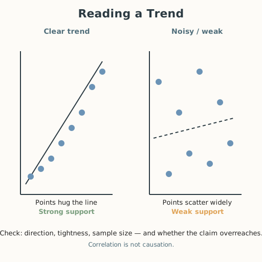
- Trend worksheet · 1 per learner Two small scatter plots (one clear upward trend, one noisy/weak) with a claim attached to each, plus practice sets
- Science journal · 1 per learner
Low-tech / no-cost
- Pebbles or seeds as data points Lay points out on the ground in order and read the rise or fall of the pattern with a stick as the trend line
- Voice and pointing Describe a trend aloud ("as years go up, temperature goes up") and trace it with a finger
Enriched / lab & device
- Spreadsheet · 1 per learner or pair Plot a real time series (e.g., local monthly temperatures) and fit a trend line to read direction and scatter
Works in different contexts
- large-group Build one scatter plot whole-class on a shared grid, then learners plot a second set in pairs and trade to critique each other's trend reading
- multi-age Younger learners read direction ("up, down, or flat") from a plot; older learners quantify scatter and test correlation-versus-causation
- self-directed A learner follows the worked trend example, then judges each practice claim against a "support" checklist and writes the verdict
- level-grouped Group by comfort with graphs; a ready group adds a second variable and argues whether correlation could be causation
- outdoor-only Measure a real trend outdoors — shadow length over the day, leaves per stem — plot it, and read the trend
Lesson 2 — Trend: How Well Does the Data Support the Conclusion?
Summary
Learners read a trend in a scatter plot — the direction a cloud of points leans — and learn to judge whether data really support a conclusion, weighing sample size, variability, and the direction of the relationship. They sharpen the distinction between correlation (two things move together) and causation (one causes the other). This completes the unit’s statistics objective.
Objectives
- Analyze data using basic statistics — mean, range, and trend — and assess how well the data support a conclusion. (D06.S1.10.01)
Connection
“Is it really getting hotter here each year?” To answer, you would not look at one hot day or one cold day — you would look at many years and ask which way the cloud of points leans. If it leans upward, there is a trend; if the points are scattered all over, the trend is weak. But even a clear trend does not prove why — hotter years and more ice-cream sales rise together, yet ice cream does not make the weather. Reading a trend honestly, and knowing what it can and cannot prove, is how you keep from being fooled by a chart.
Materials
- Trend worksheet
- Science journal
Preparation
- Copy or draw the trend worksheet.
- Retrieval: from Lesson 1, mean and range; from Grade 7, correlation versus causation (D06.S1.07.01). Today we add trend and the “how well does it support the conclusion?” judgment.
- Prepare one worked trend and two practice plots.
Facilitator note
This lesson is written to the learner (“you”). The idea to land: a trend is the direction a scatter plot leans; to judge whether data support a conclusion, weigh (1) how tight the points hug the trend, (2) how many points there are, and (3) whether the claim overreaches — correlation is not causation. Model the judgment explicitly with one worked example (S-011), then let learners judge claims in pairs.
The critical-thinking lens: the core move is “what would the data have to look like for this claim to be true — and does it?” The ethics lens: people use weak trends to sell products, win arguments, and make policy; reading a trend honestly is a protection against being misled and against misleading others. The egalitarian lens: the same chart-reading skill lets an ordinary person audit a claim made by a company or a government — it is a tool of accountability, not a privilege. The technology lens: charts, dashboards, and “the data says…” are everywhere on screens; a trend line is only as honest as the scatter behind it. Preview: Lesson 3 asks how we know science as a whole is trustworthy.
Procedure
- Recall (5 min). From Lesson 1, what are the mean and range, and what does an outlier do to the mean? From Grade 7, what is the difference between correlation and causation?
- Meet the trend (15 min). Look at a scatter plot of years (horizontal) against a town’s hottest-day temperature (vertical), with 12 points climbing from lower-left to upper-right. A line through the middle leans upward: that is an increasing trend. Now ask the three questions that judge the claim “our town is getting hotter”: Do the points hug the line (tight) or scatter (loose)? Are there enough years (sample size)? Does the claim say only “it is trending hotter” (supported) or “and we know exactly why” (overreach)?
- Guided practice (15 min). With a partner, judge two plots: one clear downward trend, one noisy cloud. For each, state the trend (up, down, weak), the sample size, and whether the attached claim is supported or overreaches. Agree before moving on.
- Independent practice (15 min). In your journal, write a claim about a trend (real or made up) and sketch the data that would support it versus the data that would undermine it. Then write one sentence on why correlation is not causation.
- Close (5 min). In one sentence: what three things do you check before believing a trend supports a conclusion?
Differentiation
- Support: Read direction only (“up, down, flat”) from a prepared plot, with the three check questions provided as a checklist.
- Extension: Take a real two-variable dataset (e.g., study hours vs. scores) and write both a supported conclusion and a causation-overreach someone might wrongly draw from it.
Assessment
- Formative (peer + self): Can the learner read a trend’s direction, describe its tightness and sample size, and say whether a claim is supported or overreaches?
- Portfolio artifact (unit): The trend worksheet with the “supported vs. overreach” verdicts, added to the data-and-evidence toolkit.
Home connection
Find a chart in a news story, on a package, or on a screen. Ask together: which way does it lean, how many points are there, and does the headline overreach what the chart shows?
Resources
- On worked examples and guided practice: Kirschner, Sweller & Clark (2006), https://doi.org/10.1207/s15326985ep4102_1 (S-011).
- On descriptive statistics and interpreting data as background: Encyclopaedia Britannica, “Probability and statistics,” https://www.britannica.com/science/probability (S-301).